paintchips.ca
This website is under development
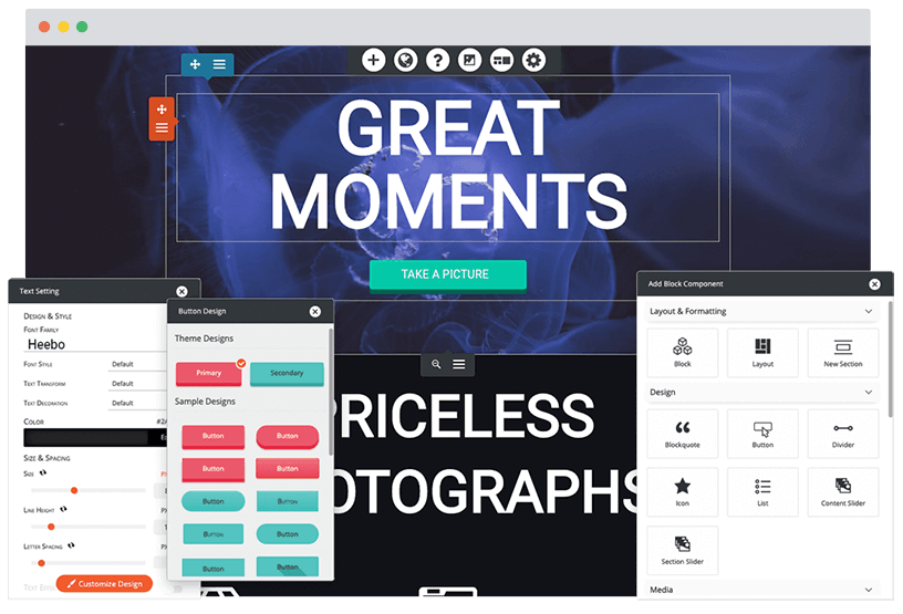
Build a better website
Managed WordPress Hosting
Get fast, secure, managed hosting, including an easy-to-use WordPress Website Builder to design like a professional.
Plans from CAD $6.99/mo
Choose a Plan